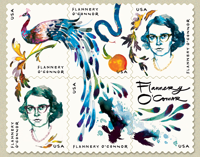
Last month the United States Postal Service issued a Flannery O’Connor stamp, complete with a glowing portrait and peacock feathers. Coincidentally, we also recently reissued all of O’Connor’s fiction with new covers painted by June Glasson and designed by Charlotte Strick. When the stamp sparked a bit of controversy, we figured, Why not? It is therefore with great pleasure that we present FSG’s take on a new Flannery O’Connor stamp, with a few words from Charlotte about the project.
opens in a new window
Work in Progress: When you first saw the USPS design, what was your gut reaction? Do they do Flannery justice? And now that you’ve tried your hand at it, how do you feel about the original? How hard are stamps to design?
Charlotte Strick: The postage stamp, though less a part of our everyday, is still an object with great design appeal, and there’s plenty of reason to celebrate Flannery O’Connor’s recent and long overdue appearance on one. Unfortunately the composition and rendering on the stamp they chose read as safe and rather saccharine. It is a real missed opportunity. The artist’s hand-tinted likeness of Flannery might have vintage allure for some, but the soft focus portrait and oversized, decorative peacock feathers (that curiously resemble swaying sand dune grasses) do little to support the composition or speak to O’Connor as a literary force. And why do away with her signature cat-eye sunglasses? A ‘soft focus’ Flannery is at odds with her belief that, “modern writers must often tell ‘perverse’ stories to ‘shock’ a morally blind world . . . It requires considerable courage not to turn away from the story-teller.”
The challenge is always to create compelling design that’s effective and memorable no matter the format. These days book jacket designs are required to “read well” online at postage-stamp-size, so it was interesting to compose a composition at an already shrunken 1 ½ x 1 ¼ inches. It would certainly be a great honor to design an official stamp for the USPS, and when their commissioned artists are permitted bigger risks, the results are even frame-worthy. For my alternative take on the O’Connor stamp, I thought about the puzzle offered up by a six-stamp grid. Using selections of the cover art from our newly rereleased O’Connor editions, I found it great fun to wrap the elements around one another in new ways—aiming for each individual stamp to be a mini-artwork of its own.
WiP: What drew you to commission June Glasson to paint the covers of the rereleases, from which you drew for this project?
The inspiration to hire June came from Milton Glaser’s 1967 cover for Wise Blood. His sooty illustration approach reminded me somewhat of Glasson’s layered ink techniques. Her series “The Foulest of Shapes” (2009) struck me with its brutal beauty. I hoped to capture some of this with our O’Connor reissues. I talk more about our collaboration here.
WiP: You’ve designed lots of jacket covers in your time, are there other authors you think might particularly lend themselves to a stamp?
This question turns out to be harder to answer than I expected. The USPS has done a good job of memorializing many of the authors I thought to look up (though it would be great fun to have the opportunity to reimagine many of them as original illustrated portraits). One worthy FSG alumna, not yet on any stamp I could find, might be M. F. K. Fisher. Perhaps in this era of food obsession, it’s high time for a stamp set of preeminent American food writers.
For fourteen years Charlotte Strick worked in-house at FSG as a designer-turned-Art Director. In 2014 she partnered with Claire Williams Martinez to form Strick&Williams, a boutique, multidisciplinary design firm focused on the arts, education, publishing, non-profits and everything in-between. A graduate of Parsons School of Design, Charlotte lives in Brooklyn, NY with her husband, their twin boys, and a giant bowl of goldfish.
YOU MIGHT ALSO LIKE:
The Supernatural Grace of Flannery O’Connor
Jonathan Franzen’s First Words on Purity
Read The Geranium by Flannery O’Connor

