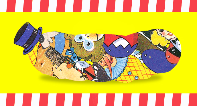
The Pickle Index is being feted far and wide as a multi-platform vision of the future of storytelling. And it is that. But it also, at heart, an old-fashioned fable in the tradition of, say, George Orwell and James Thurber (a natural pair, like a carrot and a cucumber)—a fable about a world in which pickled vegetables are the basis of the diet, the economy, the culture, and the only hope is a seemingly hapless circus troupe trying to put their arcane skills to good and desperate use . . . you can see where the Orwell and Thurber comparisons come from. Right? But anyway, what’s more old-fashioned than the actual wood-cuts that illustrate the paperback edition? Here, digital visionary Horowitz peppers Ian Huebert, print-maker and illustrator, with questions about just the distinctly analog way woodcut gets made (Look at those tools! Sharp, dangerous tools that cut into wood! Look at that printing press!)—never once letting on that the FSG Originals paperback edition contains a secret illustration of an octopus in a rowboat that is absolutely exclusive to our edition. You will, however, have the opportunity to win a signed and numbered letter-press poster by Mr. Huebert himself. So read on, friends, read on!
opens in a new window |
Eli Horowitz: Why did you do these illustrations as woodcuts? Isn’t that kind of . . . difficult?
Ian Huebert: It sure is. You have to keep your tools sharp! I’m enamored with the materials I work with, the computer being very, very low on my list. I’d rather sit at a table and chip away at a block of wood than stare at a screen. While there is a certain amount of control I’d like to have within a process, when working with a piece of wood there’s an understanding that I’m working on its terms and it has a voice in the outcome. A little more planning goes into it, since there’s no erasing or undo button. But also it’s a good way to stay open to the unexpected.
EH: Do you sketch directly onto the woodblock?
IH: First I draw the design on tracing paper—outlines of the figure, the text, and where all the colors will fall. I use tracing paper so I can easily reverse the image, since the blocks need to be reversed for printing.

EH: And then you actually carve that straight into the wood?
IH: Yup—for this project I used cabinet-grade birch plywood. The design uses two woodblocks, plus a tiny one to color the tomato. This is a relief printmaking process, meaning I cut away any material I don’t want printed. The remaining raised areas receive the ink and come into contact with the paper. You can see this from the black areas that have been inked on the block.

EH: What do you use to carve it?
IH: Mostly gouges, both U- and V-shaped, plus a knife to carve lines and fine detail. They’re made in Japan and must be kept very sharp. I sharpen them with a stone and leather strop before each day.

EH: How do you print the other colors? Does each color get a separate block of wood?
IH: Yes. The black one we saw before is called the “key block,” and this photo here shows the second block locked into the press bed. With this block, I used a reduction process: After one area of color has been carved and printed, I go back to the block and carve away more. This is then printed over the previous run. You can repeat this process multiple times to achieve multiple layers of color. It takes some careful planning as there is no going back once I start carving on the block I just printed. I used a Vandercook Universal proofing press, housed in the Type Kitchen at the University of Iowa Center for the Book.

EH: How old is this machine? Did it print “Wanted” posters in the Old West?
IH: Maybe “Wanted” posters from the 1950s. These presses were mainly used to “proof” type, when the printed word was still printed from metal type. One could print a few proofs to check for typos and overall quality before printing the type in mass on a faster machine. Nowadays folks use these presses to print all kinds of letterpress things, from high-end books to beer coasters.
EH: How do you actually make the color?
IH: The basic colors come in cans, but I mix the specific tone with a putty knife on a pane of glass. The prints then go through the press multiple times to build up different shades. The color can stand on its own, or I can print one color on top of another to make a new color.

EH: And then how did you make the little tomato red?
IH: That was the only bit of red in the entire press run, so instead of carving away all the material on the second block to accommodate this, I made a separate, much smaller block. This photo here shows the prints on the drying rack—after each run, the inks need to dry before the next color is applied.

EH: And finally the black?
IH: Yup! This is where I sigh a big sigh of relief that everything is registered properly, and then . . . Voilé! Poster! That’s the key block from the beginning—really ties everything together.

Enter to win a signed and numbered letterpress poster created by Ian Huebert.

Eli Horowitz was the managing editor and then publisher of McSweeney’s. He is the coauthor of The Clock Without a Face, a treasure-hunt mystery; Everything You Know Is Pong, an illustrated cultural history of Ping-Pong; The Silent History (FSG Originals), with Matthew Derby and Kevin Moffett; and The New World (FSG Originals), in collaboration with Chris Adrian. He lives in San Francisco.
Ian Huebert is a printmaker and an illustrator. He enjoys making things by hand, and more often than not these things end up in books. He is working on an MFA at the University of Iowa Center for the Book.
YOU MIGHT ALSO LIKE:
The Other Side of the Wall by Sloane Crosley
On Lucia Berlin: The World in Perpetual Motion
An Excerpt of Luc Sante’s The Other Paris
RELATED STORIES